Introduction
The key to a successful website is creating a great user experience for your customers. If you're not creating a smooth user experience, then you are missing out on one of the most effective marketing channels available today.
Adopt a mobile-first mindset
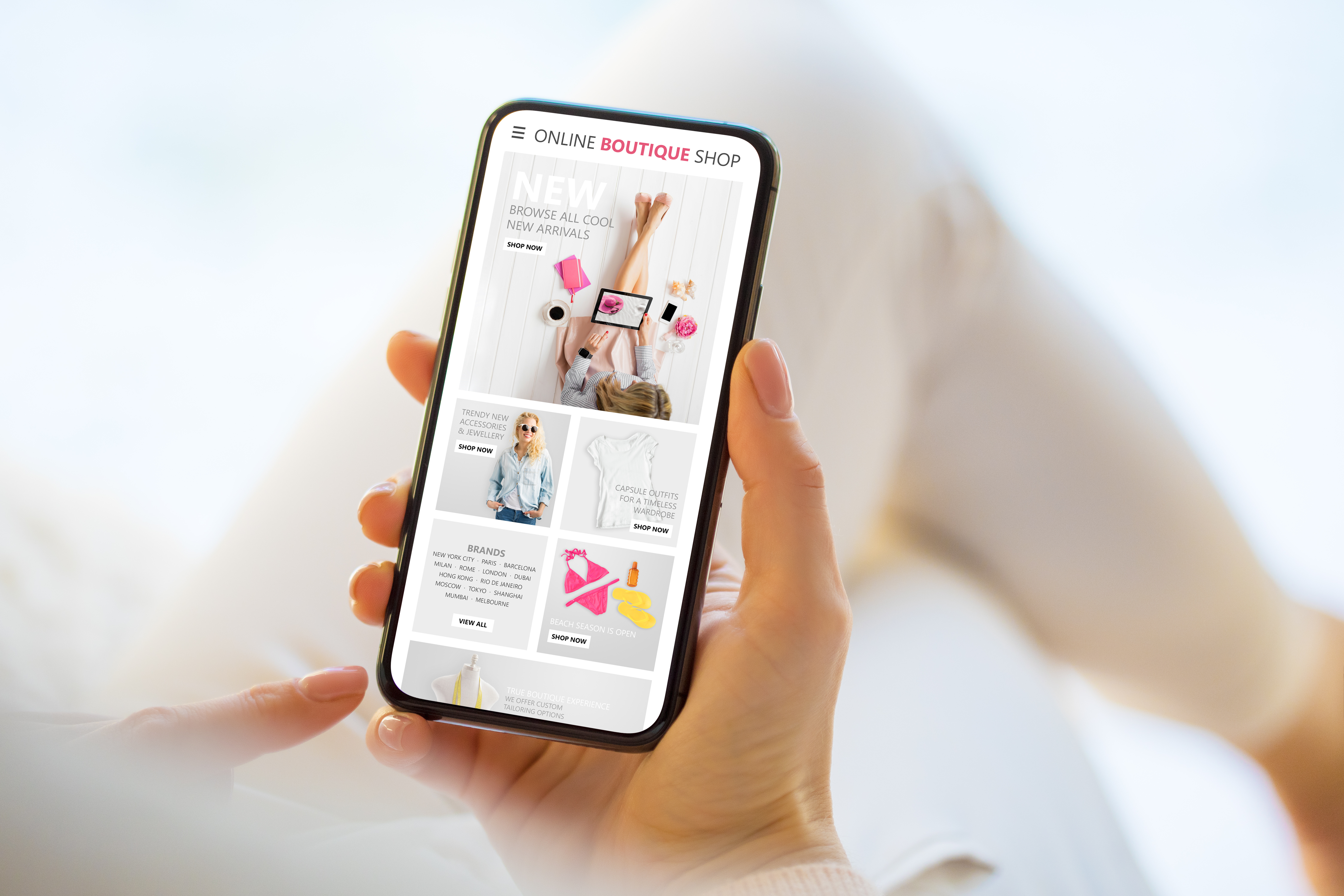
You should also make sure that your website is optimized for mobile. What does this mean? It means that when you visit a website on your smartphone, the layout of the page and its content should be easy to read.
This is especially important if you're trying to reach millennials. According to Pew Research Centre, over half of people aged 18-29 use their smartphones as their primary way to access the internet (compared with just 8% who rely exclusively on desktop computers). And more than two-thirds of millennials own smartphones (compared with half of Generation Xers and one-third of Baby Boomers).
If your target demographic doesn't have easy access to your site via their phones or tablets, it's time for some tweaking!
Optimize your site's load time
Optimizing your site's load time is key to a great website. A fast-loading site will increase the overall user experience and make it easier for people to find what they're looking for.
The following are some ways you can optimize your site's load time:
- Minimize the number of requests. The more requests a page makes, the longer it takes for each page to load. Minimizing these requests is one way you can improve your website's speed.
- Try using fewer resources on every page (such as images or videos).

Have a great user experience (UX)
UX is the user's experience of interacting with the product. It's a combination of many factors, including usability, accessibility, and aesthetics.
UX design is not just about how something looks. It's also about how it works. UX designers focus on improving peoples' experiences through interfaces that are easy to use and understand - even if you're not a tech-savvy person yourself!
Know your audience.
You should know your audience as much as possible, and then use that knowledge to create a website that will appeal to them. Understanding their needs, their behaviour patterns, and their pain points is key. You also need to understand what questions they have about your products or services; what fears hold them back from making purchases; and what values will inspire them to act.
Understanding demographics is important too: age range, gender distribution, location. Knowing these things helps you create content tailored specifically for your target market.
Create website content that delivers
When creating website content, it's important to keep the following in mind:
Don't write for search engines; write for people. Search engine algorithms are constantly changing, so it's not worth spending time trying to outsmart them. Instead, focus on creating relevant copy that will engage your audience and get them talking about your brand with their friends.
Don't use jargon or buzzwords unless they're relevant to what you're writing about. Some words may seem like they have universal meaning, but if someone from another country reads them out of context, they could end up sounding ridiculous (e.g., "let's take this offline").
Don't assume the reader knows what you're talking about - they probably don't! If there is something specific that needs explaining (e.g., a process), then do so using step-by-step instructions or visuals so that readers can easily follow along without being confused by technical language or unfamiliar concepts/ideas.
Include clear calls-to-action
A call-to-action (CTA) is an element on your website that prompts users to perform a specific action. These can be buttons, links, or text. Each CTA should clearly indicate what will happen when you click it. This includes telling the user who they'll be interacting with or what they can expect in return for their information.
For example, if you want people to sign up for your newsletter you might use text that says, "Sign up for our newsletter!" instead of just a generic "Subscribe" link. Or if you want visitors to request more information about your product or service, make sure the button says something like "Request Information" rather than "More Details." Using clear language makes it easier for people who aren't familiar with your site to understand where they're supposed to go next and what they'll get out of doing so!
Create a logical flow for visitors to follow
One of the most important considerations to make in web design is ensuring that a visitor will be able to find their way around your site.
A logical flow for visitors to follow and easy-to-understand navigation structure will help them get from one page or section on your website to another, which leads us into our next point:
-
Use clear navigation with descriptive links. When you create a menu or list of links on your site, make sure they are clear and descriptive so that visitors can easily understand what they'll see when they click through.
Make sure your navigation is easy to find. You don't want it hidden away somewhere - it should be front and centre where everyone can see it! This means making it prominent in the header area so that people don't have to scroll down too far before finding what they're looking for.
Design with white space in mind.
White space is the canvas on which your message is painted. It's what allows your content to breathe and gives it room to breathe.
White space helps people focus when they're looking at a website. The brain loves white space, so when you use it, you're making your visitors' brain happy! Imagine how much more easily your readers can concentrate when their eyes aren't jumping around the page trying to find a place where there isn't any information that obscures their view of other important elements of your site? White space gives people something to look at besides text - it provides them with places where they can stop, breathe, and consider what they've just read before moving onto the next piece of information on a page or post.
Use colour strategically.
Colour is one of the most important elements in creating a user experience that is both aesthetically pleasing and functional.
Colour can help guide users through your website, and it can also help create an identity for your brand. Colour has meaning - it evokes emotion in people, making them feel something when they see it. It also attracts attention by drawing the eye to certain areas on a page or screen. Therefore, it's important that you use colour strategically so as not to overwhelm users with too much information at once (which would distract them from completing their tasks).
Conclusion
This is just a short list of the most important things you can do to make your website great. But it's not enough to just know these things--you must put them into action. We can help you develop a webpage that enables a great user experience for your customers. Get in touch with us today to find out more.
Search
Authors