Website Reviews by Pecometer
We've audited these web pages just as thoroughly as we did the menus, assessing everything from user journey, content & branding, email pop-ups, design, and overall memorability.
We used a 3 point score system to rate the resuraunts websites on 5 key areas for a total of 15 points - including:
Key Messaging, UX, User Journey, Content and Branding, Memorability. Here's what we found:
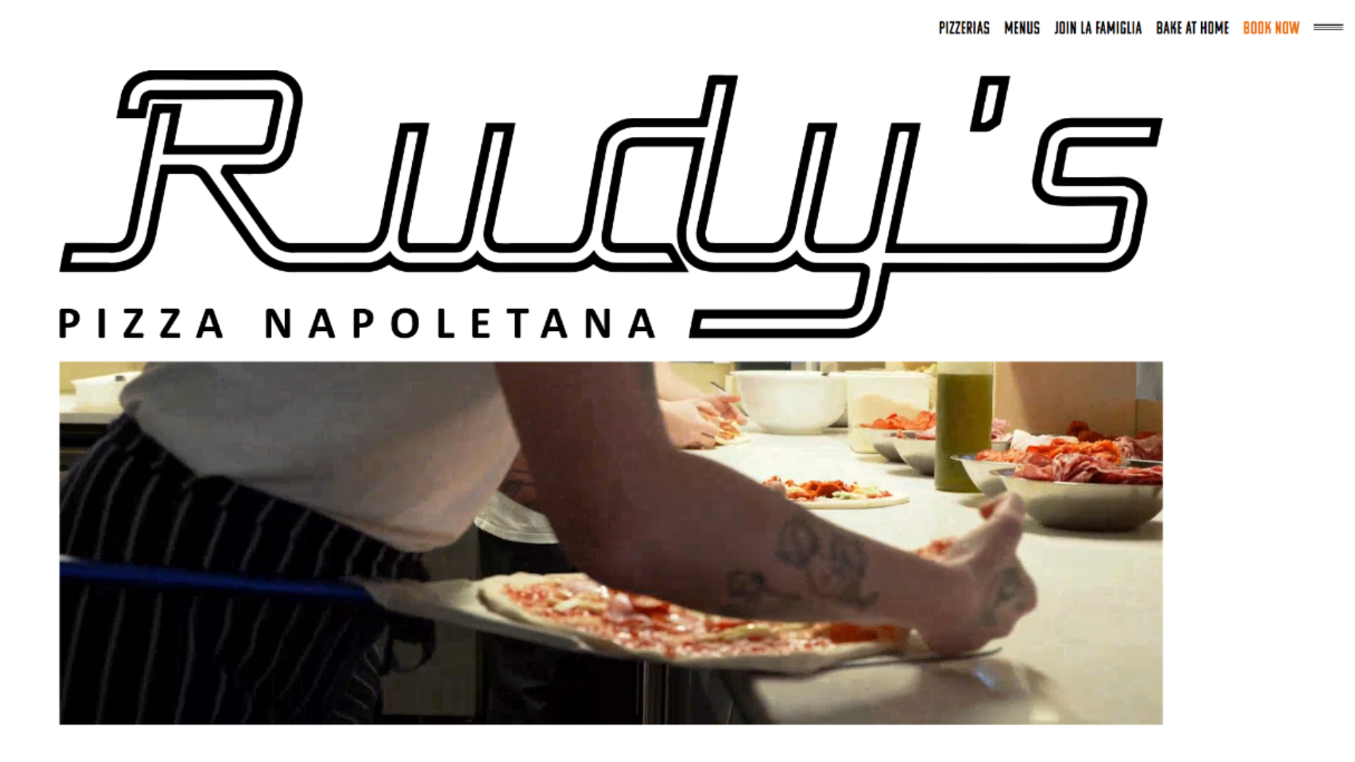
1. Rudy's Pizza
Reviewed by Hajni Hercz
Key Messaging - 3/3
U/X - 2/3
User Journey - 2/3
Content and branding - 2/3
Memorability - 1/3
Total Score: 10/15
No email pop-up but an option to sign up near the footer. The website structure is pretty straightforward, but the user experience could be improved with using a clearer type hierarchy and fixing any spacing issues. Too many different font styling (but not much difference in size) and centre aligned text paragraphs make reading harder. The use of bold, appealing images is nice, but the consistency with the branding could be further emphasised by implementing fonts that are more unique and fit into the brand image - interestingly both Rudy's and Comptoir Libanais used the same website design company!
2. Comptoir Libanais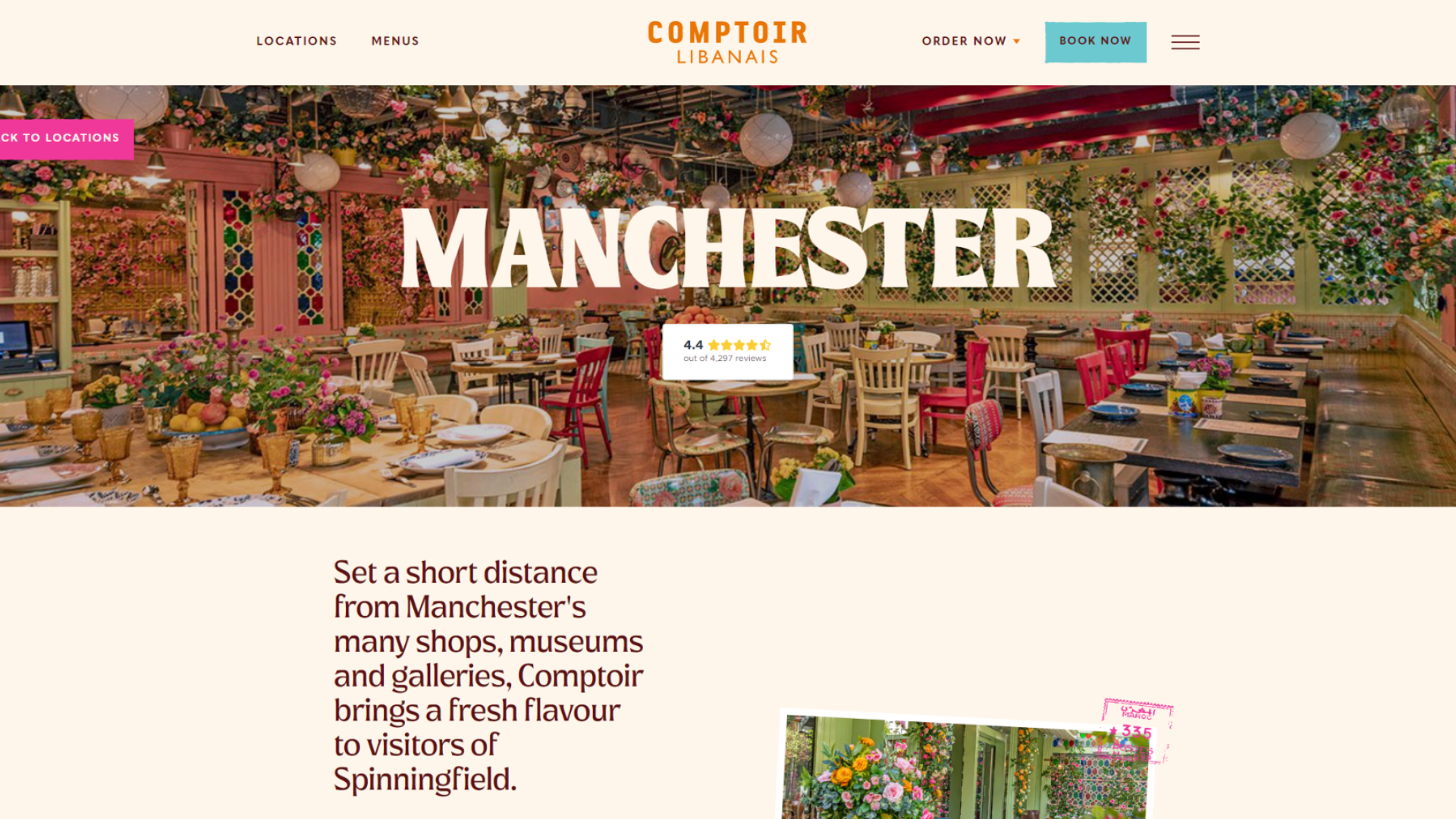
Reviewed by Hajni Hercz
Key Messaging - 3/3
U/X - 3/3
User Journey - 3/3
Content and branding - 3/3
Memorability - 3/3
Total Score: 15/15
No email pop-up but an option to sign up near the footer. Amazing example of a well designed website that is consistent with the branding, visually appealing and easy to navigate. Especially like the filtering options on the menu pages and the clear CTA buttons. Welcome email looks nicely designed, only observation is to have more contrast between the background and the type at certain sections for improved accessibility. (Interestingly both Rudy's and Comptoir Libanais used the same website design company!)
3. San Carlo
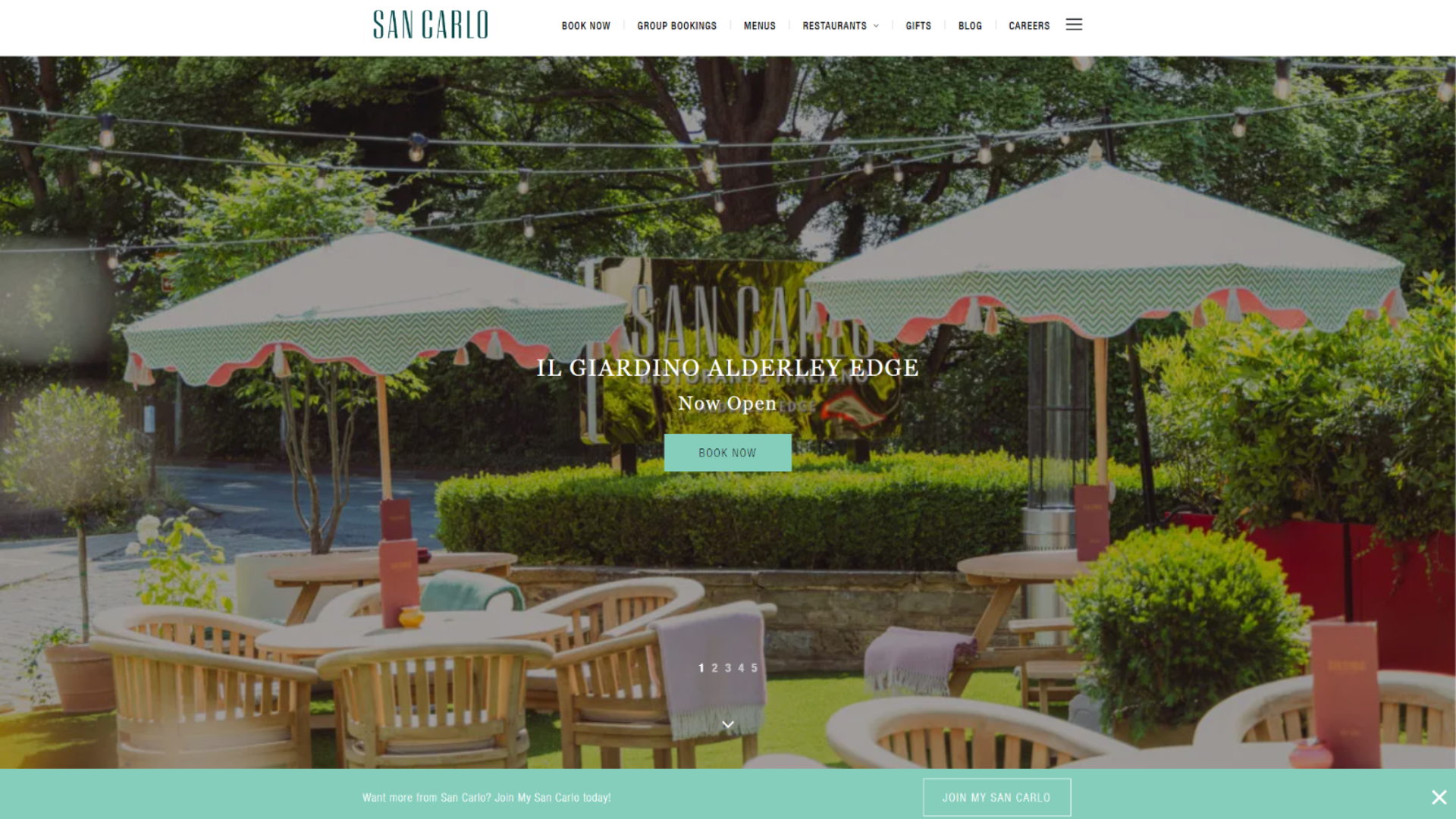
Reviewed by Phoebe Beresford-Grindrod
Key Messaging - 3/3
U/X - 2/3
User Journey - 3/3
Content and branding - 2/3
Memorability - 2/3
Total Score: 12/15
San Carlo's website is simple but effective. The key messaging is strong, clearly conveying the brand's value proposition. The user journey is well-structured. The content and branding aren't bad, but the site could use more engaging visuals and stronger branding elements. The simple design makes it easy to view the menu items, and the booking system is straightforward and user-friendly.
4. Dimitris
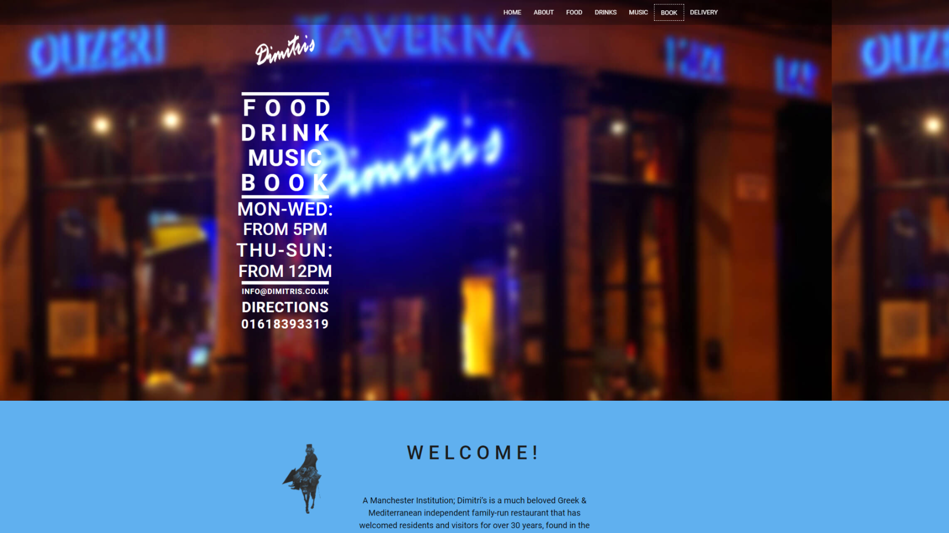
Reviewed by Niokol Stoyanova
Key Messaging - 1/3
U/X - 2/3
User Journey - 1/3
Content and branding - 1/3
Memorability - 2/3
Total Score: 7/15
Dimitri's website is quite simple, with an interesting colour scheme and only a few images. This does not reflect the gorgeous, vivid interior of the actual restaurant. The key messaging is unclear, and the user experience (UX) is subpar. The user journey is not intuitive, making navigation difficult. The content and branding feel weak, and the third-party booking system detracts from the overall user experience. However, this doesn't mean they don't serve the best Moussaka ever.
4. Bar San Juan
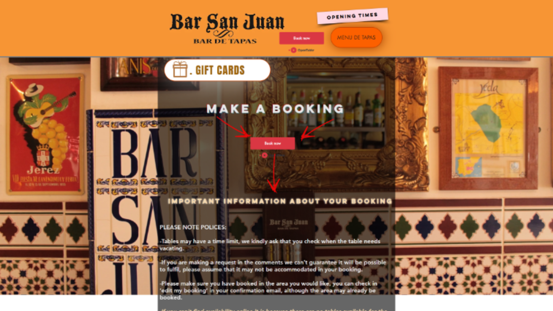
Reviewed by Caitlin Macintyre
Key Messaging - 2/3
U/X - 2/3
User Journey - 2/3
Content and branding - 2/3
Memorability - 3/3
Total Score: 11/15
Bar San Juan’s website is vibrant and busy, which mirrors the lively atmosphere of the restaurant itself. However, the design could feel overwhelming for those who prefer a more minimalist design. The site’s style is a bit outdated, but I quite like it. The booking system is user-friendly and straightforward. A standout feature is the live feed, which allows users to enlarge images and view menu items in life-size form. The site provides all the essential information needed, making it both functional and engaging. Given their friendly and close-knit presence in the restaurant, learning more about their origin story would add a personal touch to the site.
Website Reviews by Pecometer
Just as guests expect pleasant service, they also expect an easy web-experience. With so much competition in Manchester, it's important for businesses to meet these expectations or risk losing customers. From our reviews, the websites we liked most were the ones that provided ample restaurant information, high-quality images, clean layouts, and easy-to-navigate booking systems, all delivered in a functional and accessible way. There are so many simple ways for businesses to boost their sites UX, UI and overall site experience, particularly if they want to stand out against competition.


